


Building Apps
★ Premium feature
This is a premium feature, available with an active premium subscription or trial. If you don't see it, contact us or your Admin to add it to your plan.
Preview feature
This feature is currently in preview. If you don't see it, contact us or your Admin to activate it.
Preview features:
- are provided as-is and aren't meant for production use.
- may have limited or restricted functionality, and details may change before general availability.
- are supported on a best-effort basis and may be subject to reduced or different security, compliance, and privacy commitments.
The app list
The Studio tab shows one card per app, with a miniature of its layout, its publish status, when it was last updated and by whom, and the link the app is published under. Add App in the header creates a new, empty app and opens it in the editor. Search by name, or filter the list down to a single role using Filter by role with access. Each card carries chips showing which roles can see the app and why - see Sharing & Ownership for how that is determined.
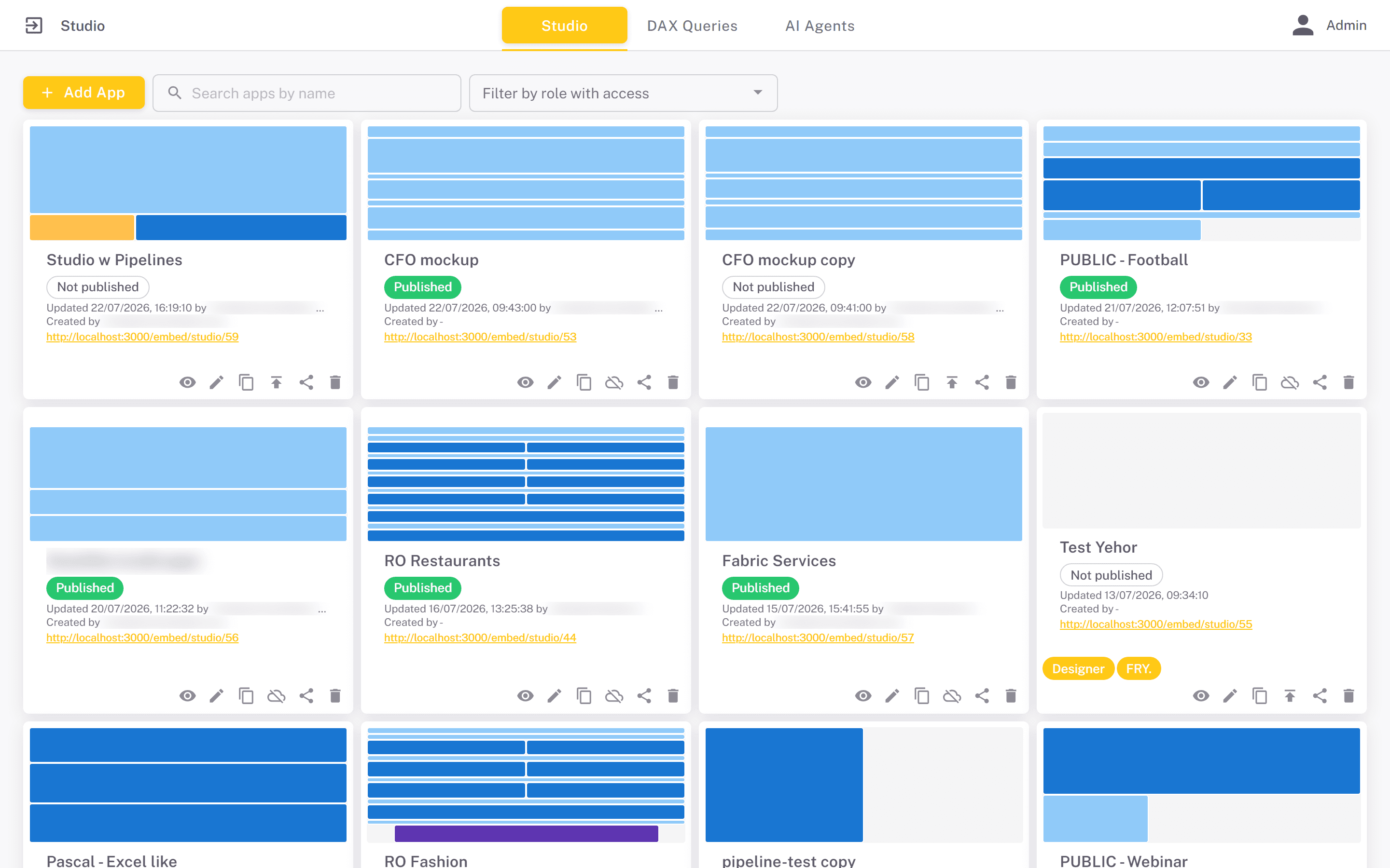
The status chip is one of three values:
- Not published - the app exists only as a draft. Its link does not resolve.
- Published - the live version matches the draft.
- Unpublished changes - the app is live, but the draft has been edited since the last publish. Viewers still see the older published version.
The icons on each card cover the whole lifecycle: Preview opens the app read-only in a full-screen dialog, Edit opens the editor, Duplicate creates an unpublished copy, Publish / Unpublish take the app live or offline, Share manages which roles can see it, and Delete removes it. The Share icon only appears for the role that owns the app, and for admins.
The canvas
Inside the editor, the Component library at the top adds components to the canvas - HTML, D3 Visual, Vega Visual, AI Agent and Run Pipeline. Adding one drops it below the existing content and opens its configuration dialog immediately. The components themselves are described in Components.
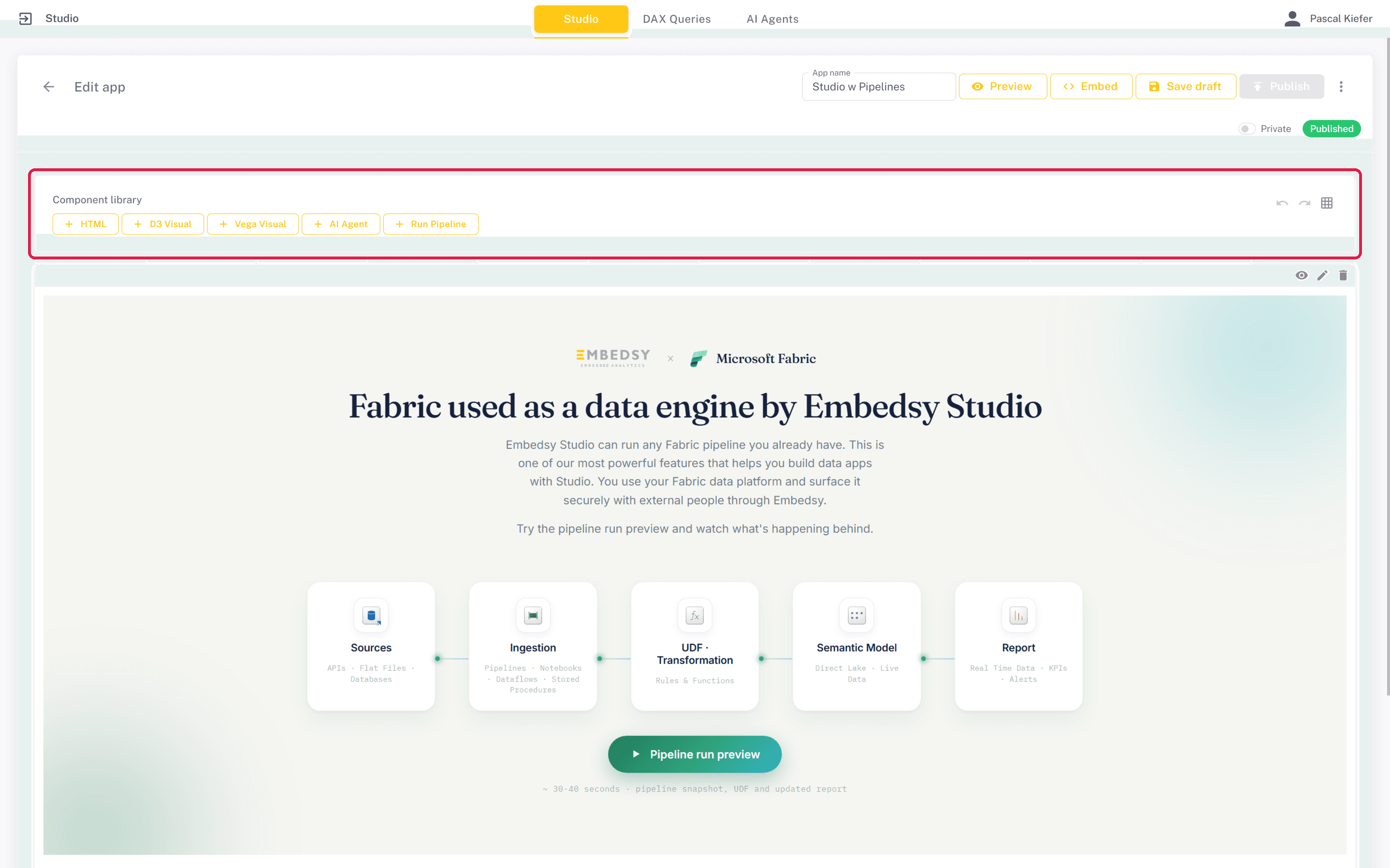
The canvas is a twelve-column grid and tiles snap to it. Drag a component by the strip along the top of its tile to move it, and resize it from any edge or corner - the resize handles appear when you hover over the tile. Each tile has three controls in that strip:
- Hide / show - a hidden component stays in the editor, dimmed and marked Hidden, but is left out of the published app and of the preview. Useful for parking a component you are not ready to release.
- Edit - opens the full-screen configuration dialog for that component.
- Delete - removes the component from the app after a confirmation.
While you drag, the canvas previews exactly what will happen when you let go. Drop a tile almost entirely onto another one and the two swap places; drop it anywhere else and it takes that spot and pushes whatever was there downwards.
For finer control, click a tile to select it and use the arrow keys to nudge it one cell at a time. A nudge that would leave the grid or land on another tile is ignored. Press Esc to deselect, or to abandon a resize you are in the middle of without applying it.
Three buttons sit to the right of the Component library heading above the canvas:
- Undo (Ctrl+Z) and Redo (Ctrl+Shift+Z, or Ctrl+Y) - these cover every layout change, including adding, deleting, hiding, moving and resizing components. On a Mac use Cmd instead of Ctrl.
- Show / hide grid - toggles the grid lines on the canvas, which makes it easier to line tiles up.
Undo history is kept for the current editing session only - it starts empty each time you open the editor and is not restored after a reload.
On phones and other narrow screens the tiles stack into a single column, following the order they appear on the canvas from top-left to bottom-right. Keep that reading order in mind when arranging an app that will be viewed on small screens.
Configuring a component
The configuration dialog is split into three parts. Title & subtitle are optional and render above the component in the published app; the subtitle accepts markdown. Content holds the settings specific to the component type. Preview shows the component exactly as viewers will see it, and updates as you edit - drag the divider between the two panes to give either side more room. Changes are only kept when you press Save in the dialog.
Drafts and publishing
Every app has two versions: the draft you edit, and the published version that viewers see. They move independently.
- Save draft stores your work without affecting anyone viewing the app. An app can be saved as a draft indefinitely and never published.
- Publish copies the current draft over the published version and takes the app live. The first time you publish, a confirmation says who will be able to open the link: anyone who has it, for a public app, or only users signed in to the portal, for a private one - see Public or private.
- Discard changes, in the overflow menu, throws away every draft edit made since the last publish and resets the canvas to the live version. This cannot be undone.
- Unpublish takes the app offline - its link stops resolving - while keeping both the draft and the last published version. Publishing again restores it.
The header shows an Unsaved marker while the draft differs from what is stored, and navigating away with unsaved work prompts you to save, leave anyway, or stay.
Previewing
Preview in the editor renders the app read-only in a full-screen dialog, including edits you have not saved yet, and with hidden components left out. It is the quickest way to check what viewers will get before publishing.
Embedding an app
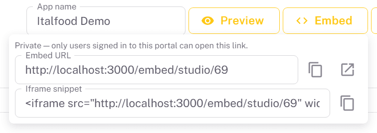
Embed in the editor gives you two things: the app's URL, and a ready-to-paste <iframe> snippet - both pointing at the same address. From there you can:
- Share the URL directly as a stand-alone app.
- Paste the iframe into any website or platform that allows embedded content. A private app shows visitors who are not signed in to the portal a sign-in message instead of the app.
- Show it inside the Embedsy Portal by adding it as an Iframe/Website page, pasting the address above into the iframe snippet, so the app sits alongside your reports.
Only the published version is served through that link, and only while the app is published. Hidden components are never included. Above the URL, the Embed panel states whether the app is public or private, which decides who can open the link.
Public or private
Every app is either public or private, set with the Private switch in the editor, just above the canvas next to the status chip. An app is public until you turn the switch on.
A public app is open to anyone with the link. No sign-in is required: anyone who has the link, or visits a page that embeds it, sees the app and the data it displays - whichever roles it is shared with in Studio. Make an app private unless its contents are safe to expose, and unpublish it to cut off access entirely.
Making an app private
- Open the app in the editor with Edit on its card in the app list.
- Turn on the Private switch above the canvas. For an app that has already been saved, the setting is stored as soon as you flip the switch and applies to the live link straight away - there is nothing to republish.
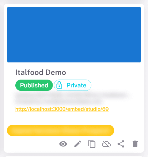
- Check the result: the app's card in the list now carries a Private chip, and Embed in the editor reads "Private - only users signed in to this portal can open this link."
Turning the switch off makes the app public again, with the same immediate effect.
Who can open a private app
A private link first asks the visitor to sign in to the portal. A signed-in user can then open the app if their role:
- is an admin or super admin, which can open every app;
- owns the app - the portal role or Entra role it was created in;
- has the app shared with it, as a portal role or an Entra role (see Sharing & Ownership); or
- has a portal page that embeds the app - an Iframe/Website page pointing at the app's link.
Any other signed-in user sees a message that the app has not been shared with their role and is asked to contact an administrator.
To let a role view a private app without editing it, add it as a page rather than sharing it. Sharing grants full working access in Studio - open, edit, publish and delete - while a portal page in the role's menu only lets its users view the published app.