

Components
★ Premium feature
This is a premium feature, available with an active premium subscription or trial. If you don't see it, contact us or your Admin to add it to your plan.
Preview feature
This feature is currently in preview. If you don't see it, contact us or your Admin to activate it.
Preview features:
- are provided as-is and aren't meant for production use.
- may have limited or restricted functionality, and details may change before general availability.
- are supported on a best-effort basis and may be subject to reduced or different security, compliance, and privacy commitments.
An app is assembled from five kinds of component, added from the Component library in the app editor. Each one is configured in a full-screen dialog with three sections: an optional Title & subtitle (the subtitle accepts markdown), the Content settings for that type, and a live Preview. Changes are kept only when you press Save.
HTML
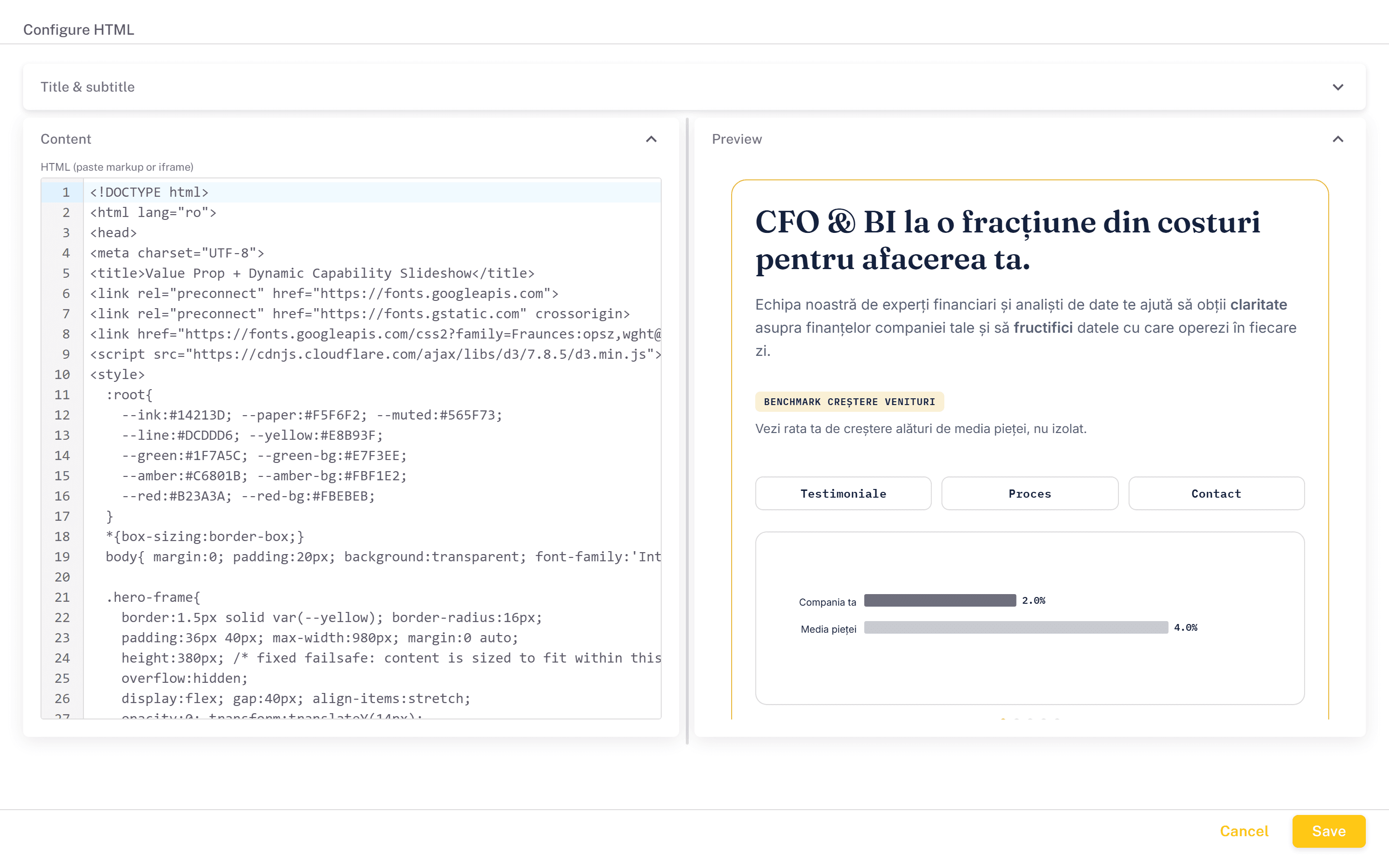
A block of your own HTML, CSS and JavaScript, edited in a code editor and rendered live. Use it for headings, explanatory text and layout. Scripts, forms, pop-ups and dialogs work, but the block runs in a sandbox, isolated from the portal page and its sign-in session.
To embed other content, paste a single <iframe> with an https address and nothing else. It is shown as it is, which suits any page that allows iframe embedding, including a Power BI report or visual published through the portal's Public Embed feature.
localStorage works inside HTML blocks and D3 visuals and is shared between all of them in the same app, so one component can pass a value to another. It is kept only while the app is open.
D3 Visual
A fully custom visualisation written in JavaScript against D3, with your semantic model as the data source. Configuration has two parts.
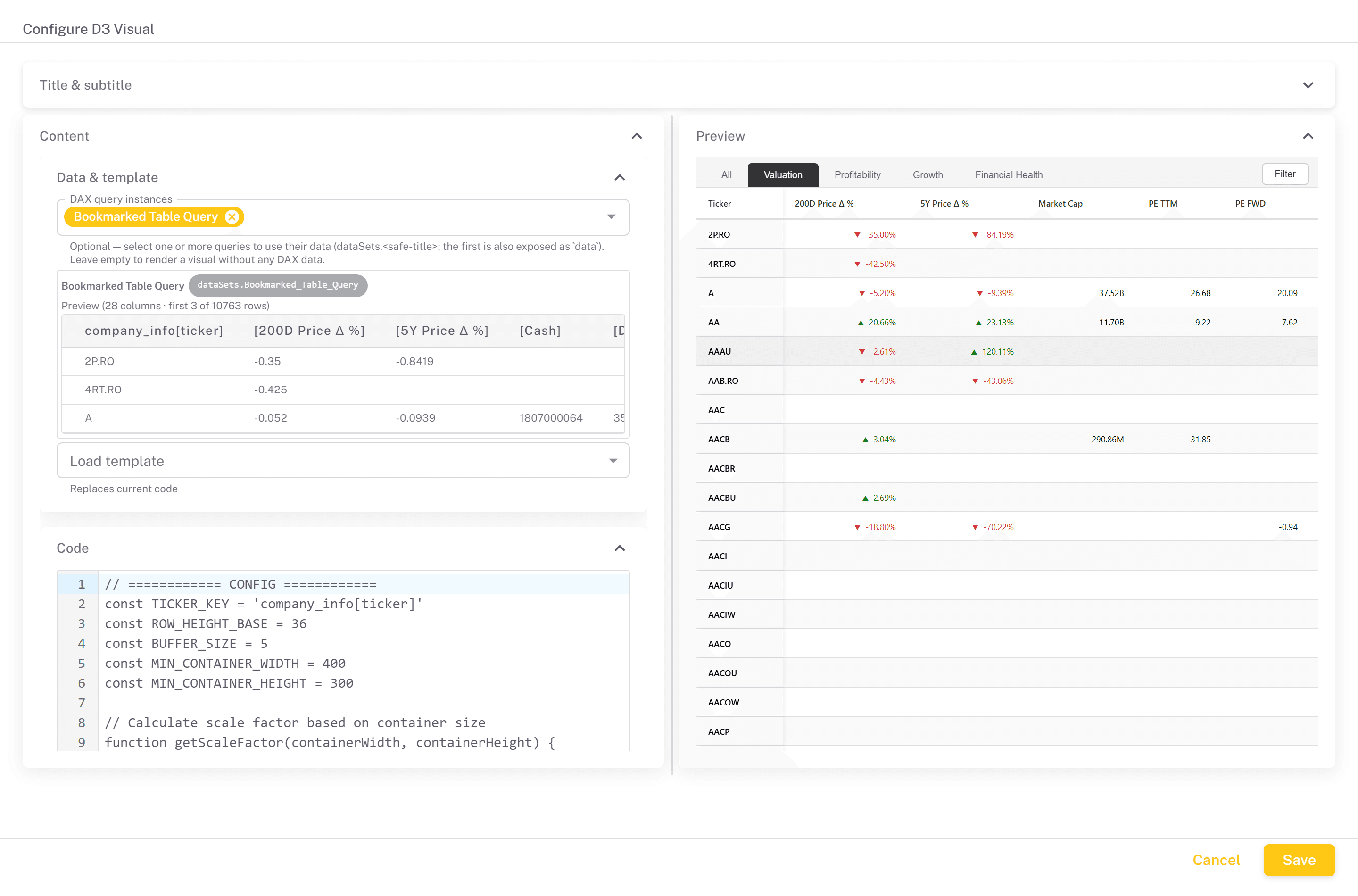
Data & template. Pick any number of saved DAX queries under DAX query instances. Each selected query runs when the component loads, and its first three rows are previewed so you can see the shape of the data you are coding against. Selecting no query is valid, for a visual that fetches its own data or needs none. Load template replaces the code with a worked starting point: bar and column charts (basic, clustered and stacked), line, area, scatter, strip, histogram, pie, donut and treemap.
Code. Your code runs with D3 version 7 already loaded, and receives:
d3- the D3 library.data- the rows of the first selected DAX query.dataSets- every selected query, under a key made from its title: anything other than letters, digits and underscores becomes an underscore, so Sales by Region isdataSets.Sales_by_Region. The dialog shows each key as a chip next to the query name.container- the element to render into, already sized to the tile.kql(cluster, database, query)- runs a KQL query against a Fabric Eventhouse or Azure Data Explorer cluster and resolves to its rows.clusteris the https address of the cluster. The query runs on the server, so no token reaches the browser, and only read queries are allowed: management commands (starting with.) are rejected.
Each row is an object keyed by column name exactly as Power BI returns it, for example row["Sales[Amount]"] for a column or row["[Total Sales]"] for a measure. The code is wrapped in an async function, so you can use await at the top level, for example to await a kql() call before drawing. Anything that throws is shown in the tile as a D3 error, and a failing DAX query shows its error at the top of the tile.
Vega Visual
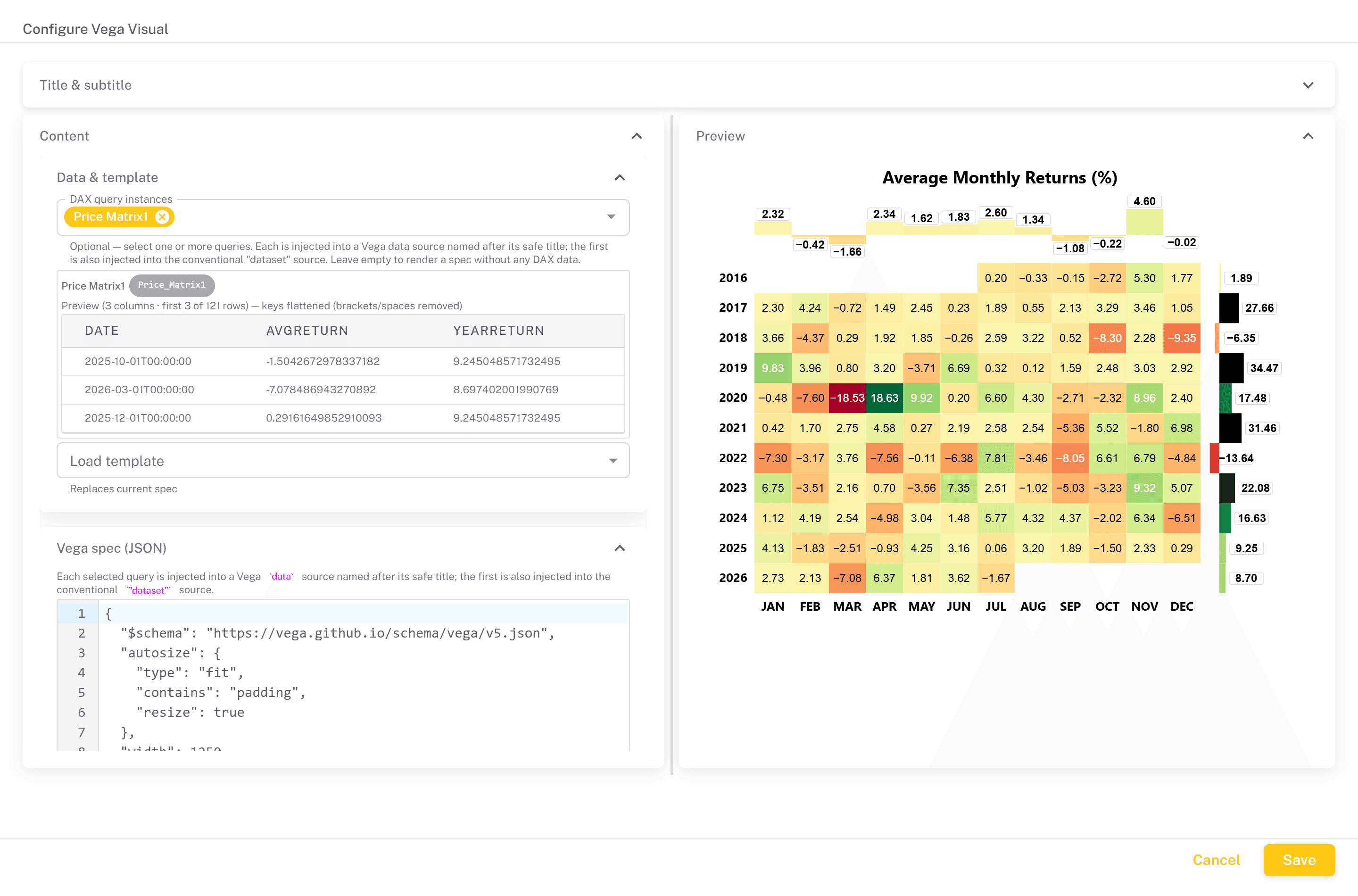
The declarative alternative to a D3 visual: instead of drawing code, you write a Vega or Vega-Lite specification as JSON and the chart is rendered from it. Vega is usually the faster route for a standard chart; D3 is the one to reach for when you need something a chart grammar cannot express. Templates are provided for line, area, scatter, strip, histogram, pie and donut charts.
DAX queries are selected as for a D3 visual, and their rows are injected into the spec's data sources:
- A data source whose
namematches a query's key (the chip shown next to it, built from the title as for D3) receives that query's rows. - A data source named
datasetreceives the first query. If no name matches at all, the first data source in the spec receives it, and a spec with nodatagets adatasetsource added. - Column names are flattened: brackets are removed and spaces become underscores, so
Sales[Amount]becomesSalesAmountand[Total Sales]becomesTotal_Sales. The preview in the dialog shows the flattened names.
The chart's width is always set to fit the tile, whatever the spec says. Invalid JSON or a spec Vega cannot render is reported at the top of the tile.
AI Agent
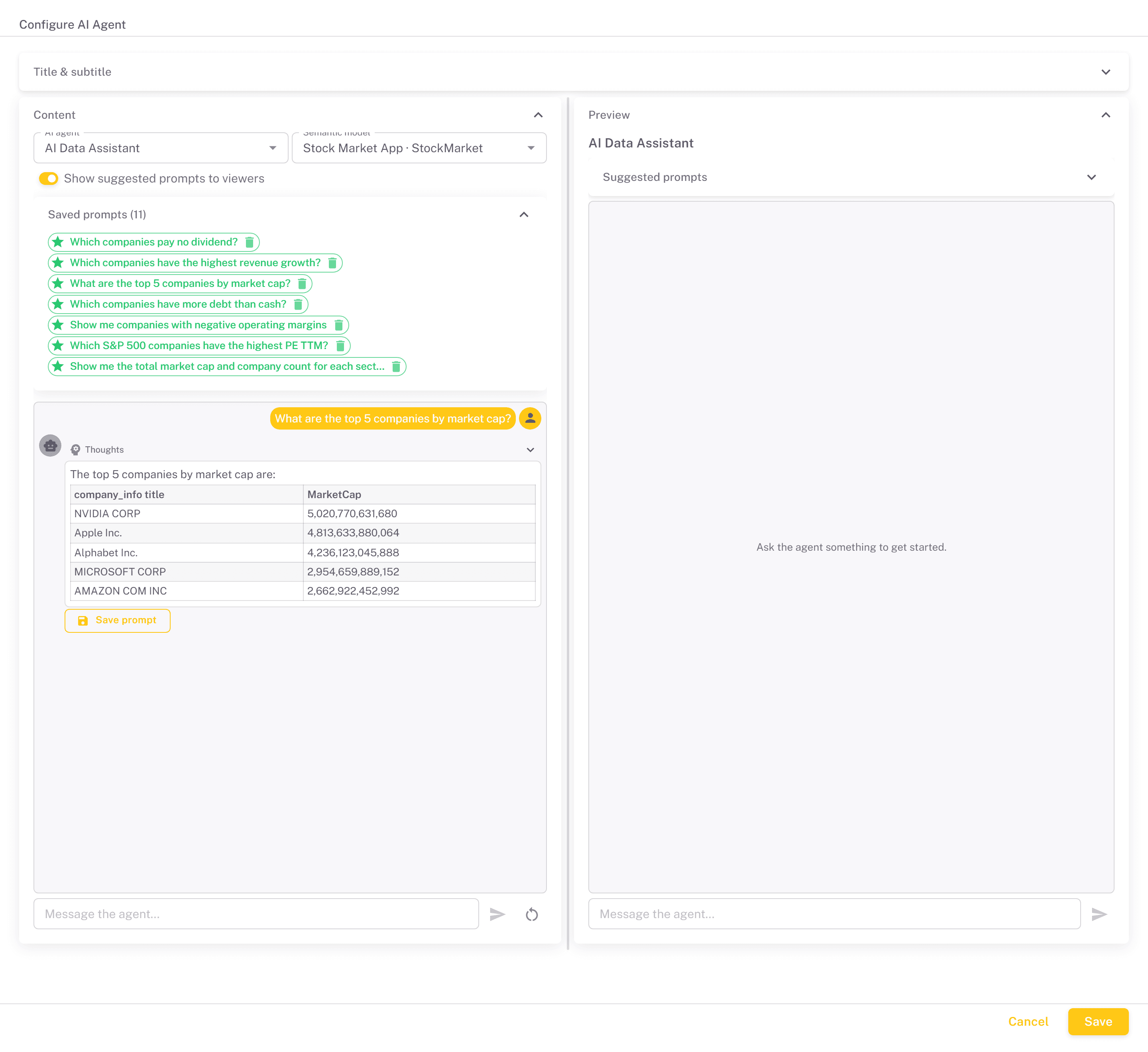
A chat panel that lets viewers ask questions about your data in plain language. Configure it by choosing an AI agent, defined on the AI Agents tab, and the Semantic model it should work against. Only models marked as open to LLMs on the Semantic Models screen are listed.
What a viewer gets back depends on the agent's type. A DAX query agent answers with a DAX query, which the viewer can edit and then run with Execute to see the rows in a table. A Plain-English answer agent runs the queries itself and replies in prose with the figures. Answers stream in as they are generated, with the agent's reasoning in a collapsible Thoughts section, and the conversation can be cleared at any time.
While building, Save prompt under an answer stores the question and its answer in the portal's prompt library, listed under Saved prompts. Click the star on a saved prompt to endorse it, or the bin to remove it. Viewers of the published app see only endorsed prompts, as Suggested prompts they can click to fill the chat box. The library is shared by the whole portal, so an endorsed prompt appears in every AI Agent component. Turn off Show suggested prompts to viewers to hide the suggestions in this component.
Run Pipeline
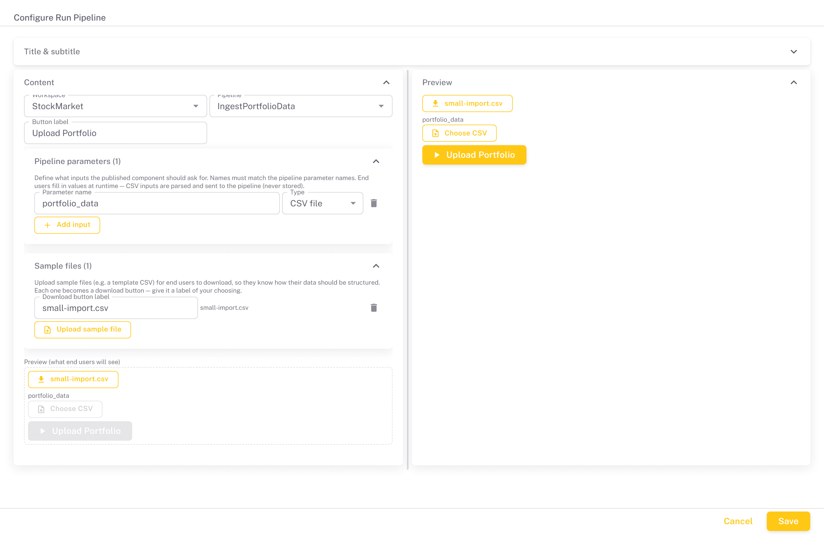
A button that starts a Microsoft Fabric pipeline, optionally collecting input from the person clicking it: triggering a refresh, submitting a correction, or uploading data for processing.
Choose a Workspace and then a Pipeline; Studio reads the parameters the pipeline exposes.
The pipeline must expose a parameter named user. Studio refuses to save the component without it. When the button is pressed, Studio fills user with the email address of the signed-in person who pressed it, or leaves it empty if the viewer is not signed in. If the pipeline has no user parameter, add it in Fabric and reselect the pipeline.
The rest of the configuration controls what end users see:
- Button label - the text on the button, Run pipeline by default.
- Pipeline parameters - the inputs to ask for, added with Add input. Each has a name, which must match the pipeline's own parameter name, and a type: String, Number, or CSV file. A CSV input gives the user a file picker for a comma-separated file of up to 5 MB with a header row. The file is sent to the pipeline as a list of rows, each keyed by column header, and is not stored anywhere.
- Sample files - files you upload with Upload sample file for users to download, typically a template CSV showing the expected columns. Each becomes a download button with a label of your choosing.
A preview at the bottom of the settings shows the form as end users will see it. In the published app they fill in the inputs and press the button, which starts a pipeline run and confirms it has started. The app does not wait for the pipeline to finish.
Anyone who can open the app can run the pipeline. In a public app that includes people who are not signed in. Make the app private if only portal users should be able to start it.